
Responsively App
Design
Inspect a website in several viewport previews at once
Editorial discoveryOpen source

0 props
Props are a thank-you from members.
 Full size
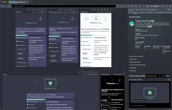
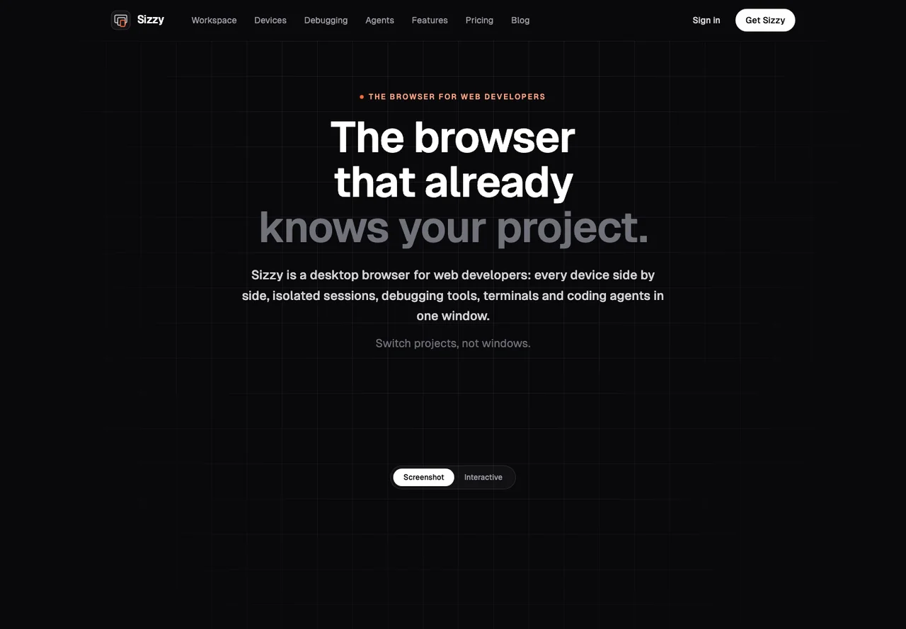
Sizzy is a browser for web development that displays a site at multiple screen sizes. Open a representative page and compare navigation, form fields and content when the viewport changes. Seeing several sizes together is useful for finding layout decisions that work on one screen and fail on another. Treat the device panels as previews and test important interactions on physical devices as well. Before choosing it, check the supported desktop platforms and whether your local development setup or authenticated test site loads properly. Use an existing responsive issue to see whether the preview workflow helps you reproduce and resolve it faster.
Good products deserve a good conversation.
Be the first to start one.