
Sizzy
Design
Preview the same site across multiple device layouts
Editorial discoveryPaid

0 props
Props are a thank-you from members.
 Full size
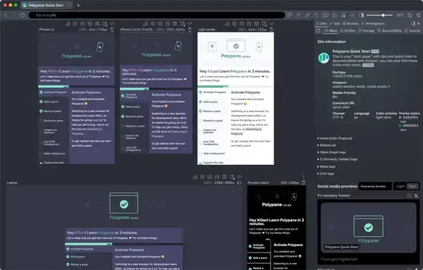
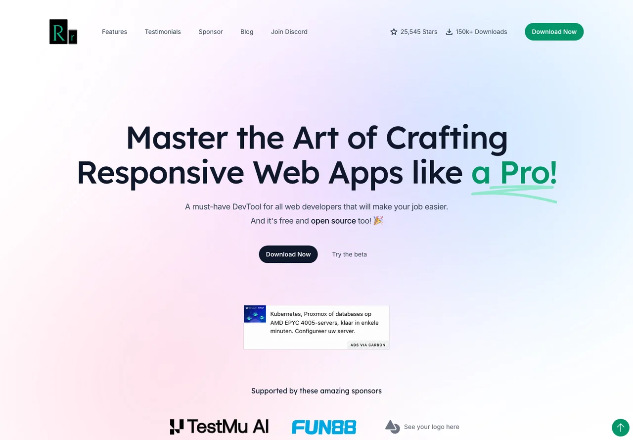
Responsively App displays a web page across multiple viewport sizes in one workspace. Start with a page from your local project, then compare how a menu, dialog or large content block behaves as available width changes. Seeing layouts side by side can help pinpoint a breakpoint issue without repeatedly resizing one window. It is an inspection aid and the previews cannot replace testing every browser engine or real touch interaction. Check platform support and local network access for the sites you use. Include a keyboard navigation pass and real-device checks for the interactions that matter before releasing a redesign.
Good products deserve a good conversation.
Be the first to start one.